
Imagine you are waiting at traffic lights. For most people, it goes without a doubt that red stands for “stop” and green for “go”. But what if you can’t tell the difference between red and green, as is the case with red-green deficiency? Fortunately, the position of the lights – up for “stop” and down for “go” – still helps to convey this important information. This principle of redundant signaling is a key concept in UX design, especially when it comes to designing for users with color blindness.
Similar to traffic lights, digital products must be designed in such a way that information is not conveyed exclusively via colors. Color blindness, or more precisely color vision deficiency, affects a significant portion of the population and poses a particular challenge in web design.
Basics of color perception and color blindness
In order to understand the challenges and solutions in UX design for people with color vision deficiencies, it is first important to become familiar with the basics of color perception and the different forms of color blindness.
How does color perception work?
Color perception is created by the interaction of light, eyes and brain. Your eyes contain photoreceptors, so-called cones, which react to different wavelengths of light and thus enable the perception of colors. Most people have three types of cones that react to red, green or blue – the primary colors from which all other colors are mixed.
What is color blindness?
Color blindness, also known as color vision deficiency, occurs when one or more of the cone types are missing or not functioning properly. This means that you cannot see certain colors in the same way as most other people.
The most common forms of color blindness
Comparison: Without color vision deficiency:

A leaf in the forest: original state
Red-green weakness (deuteranomaly/protanomaly):
This is the most common form of color blindness. People with red-green deficiency have difficulty distinguishing between different shades of red and green. For them, certain shades of red may appear greener and vice versa. In practice, this means, for example, that a red button on a green background can be difficult to see, as both colors appear more similar than for people with normal color perception.

A leaf in the forest: simulation of protanomaly (red weakness)

A leaf in the forest: simulation of deuteranomaly (green weakness)
Blue-yellow weakness (tritanomaly):
This form is rarer and affects the perception of blue and yellow tones. People with tritanomaly often see blue and yellow tones less saturated and have difficulty distinguishing them from green or red tones. This can lead to confusion in designs if, for example, yellow text is placed on a light blue background.

A leaf in the forest: simulation of tritanomaly (blue-yellow weakness)
Total color blindness (achromatopsia):
This is a rare condition in which people cannot perceive color at all, but see the world in different shades of gray. In such cases, it is important that UX designers focus heavily on contrast, texture and visual and descriptive elements to convey information.

A leaf in the forest: simulation of achromatopsia (total color blindness)
Impact on the UX design
Considering color vision deficiencies in UX design is crucial to ensure that your products are accessible to all users. The design should be such that information is not communicated solely through color, much like the redundant signals of a traffic light that communicate through both color and position.
The importance of colors in UX design
Colors are not only aesthetic elements, but also have a profound effect on the user experience. They can influence feelings and moods, direct attention and convey essential information. Therefore, a thoughtful use of color in design is essential.
Color as a navigation aid
Colors help users to find their way around apps and websites. A good example of this is the use of blue tones to highlight links. This signals to users that texts in this color are clickable and lead to further information. In an e-learning app, for example, all interactive lessons could be displayed in a striking shade of blue, while non-interactive content is kept in a neutral gray. This makes it easier for users to distinguish between clickable and non-clickable elements.
Color as a means of conveying information
Colors can convey complex information quickly and efficiently. Red is often used to indicate warnings or errors, while green signals success or confirmation. In a financial app, positive account changes (such as cash receipts) could be shown in green and expenses or fees in red. This allows users to get an overview of their finances at a glance and quickly grasp important information.
Color to promote brand identity
A brand’s color palette contributes significantly to brand recognition and brand image. For example, a lifestyle app could use soft pastel shades to create a relaxed, friendly atmosphere that aligns with the brand message of mindfulness and well-being. This choice of specific colors can evoke certain associations and feelings in users.
Color to create an emotional connection
Colors can also be used to create an emotional connection with the user. For example, a travel app that uses vibrant and warm colors reflects the joy and excitement of travel and appeals to users emotionally. The right choice of color can create a sense of confidence, joy, calm or even excitement.
Color to improve user-friendliness
A well-designed color scheme can greatly enhance the usability of a product, especially if it addresses the needs of users with visual impairments. For example, a news app could use high contrast between text and background as well as between different UI elements to facilitate readability and navigation for all users, including those with impaired vision.
The careful and strategic use of color in UX design can thus significantly improve the user experience and help to effectively communicate a brand’s goals and values.
Guidelines for colorblind-friendly design
When designing digital products, it is crucial that they are accessible to all users, including those with color vision deficiencies. A colorblind-friendly design takes into account different forms of colorblindness and ensures that information is not conveyed through color alone. Here are some important guidelines to ensure inclusive design:</span
Use of contrast and color saturation
- High contrast: Make sure that texts and important elements have a high contrast to the background. This improves readability for all users, especially those with limited color perception.</li
- Clear color saturation: Use colors with high saturation to highlight important elements. Bright and deep colors are easier to see for people with color vision deficiencies than pastel shades.
Alternative visualization methods
- Use of symbols and text: Supplement color cues with text labels or symbols. For example, a red error message could also contain an exclamation mark or the text “Error”.
- Patterns and textures: Use patterns and textures to convey important information. This is particularly helpful for diagrams or maps where colors alone may not be enough.
Avoid color as the only source of information
- Multi-channel communication: Never rely solely on color to convey important information. Make sure that the information remains understandable even without color recognition.</li
- Redundant cues: Provide additional cues, such as text messages or audible signals, to ensure that the information is also understood by users with color vision deficiencies.
Use of color blindness simulation tools
- Testing and adaptation: Use tools that simulate how your designs will look for people with different types of color blindness. This helps to identify and adapt potential problems early on.</li
Regular user testing
- Involve users with color vision deficiencies: Conduct regular tests with real users who suffer from color blindness to get direct feedback. This ensures that the design is truly accessible.
By following these guidelines, designers can ensure that their products are accessible to a wider audience, regardless of their ability to distinguish colors. This not only contributes to overall accessibility, but also improves the overall quality of the design.</span
Tools and resources for designers
For designers who want to specialize in colorblind-friendly design, there are a variety of tools and resources available:</span
The A11Y Project
An open, community-driven project that simplifies web accessibility.
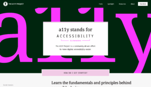
Screenshot of https://www.a11yproje ct.com/ (December 29, 2023)
Color Blindor
Website with a color blindness simulator
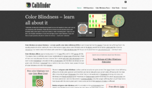
Screenshot of https://www.color-blindness.com/ (December 29, 2023)
Axe Chrome Plugin
An in-browser tool for Chrome Developer Tools that provides quick and detailed accessibility reports.
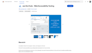
Screenshot of https://chromewebstore.google.com/detail/axe-devtools-web-accessib/lhdoppojpmngadmnindnejefpokejbdd?pli=1(December 29, 2023)
These tools and resources are essential for designers who want to create inclusive and accessible design. They offer both practical support and valuable insights into industry best practice.</span
Conclusion
Considering colorblindness in UX design is not only a matter of accessibility, but also an essential aspect of user-centricity and design quality. By understanding the different forms of color vision deficiency and their impact on the user experience, designers can create digital products that are accessible to a wider audience. Adhering to colorblind-friendly design guidelines and using specialized tools and resources will help break down barriers and ensure an inclusive user experience. Ultimately, designing with colorblindness in mind is a step towards a design that considers and values all users.</span